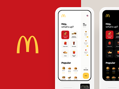
McDonald's Touch Interface Concept
Working on improvement of a well-known fast-food terminal. We have highlighted the following main weaknesses in the current interface:
1. It takes too much time to add the same position twice (for example, 2 identical burgers). Banner on the top is not eye-catching and appears above the eye level.
2. There is also a problem when you need to go to a separate screen to edit the order. We updated it so that the order can be edited at any time.
3. It would be useful to display various promotions, special offers and new items all in one place. That's why we added a "popular" section on the main screen.
More by Cuberto View profile
Like


