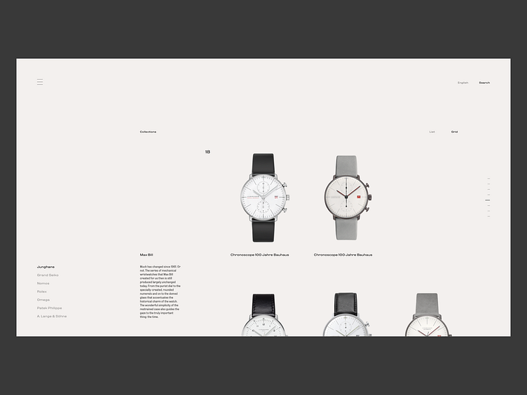
Watch Ecommerce Site - Collections
The element placement is all about the page diagonals. Also wanted to make 3/4 of the page for the collection info and items and 1/4 for navigation.
Again, tried to make it as clean as possible, so you can focus on the watch
What do you think?
- SOCIAL MEDIA - Instagram - Behance - Say Hi - hi@unick.co
More by Nikola Uzunov ☛ View profile
Like

