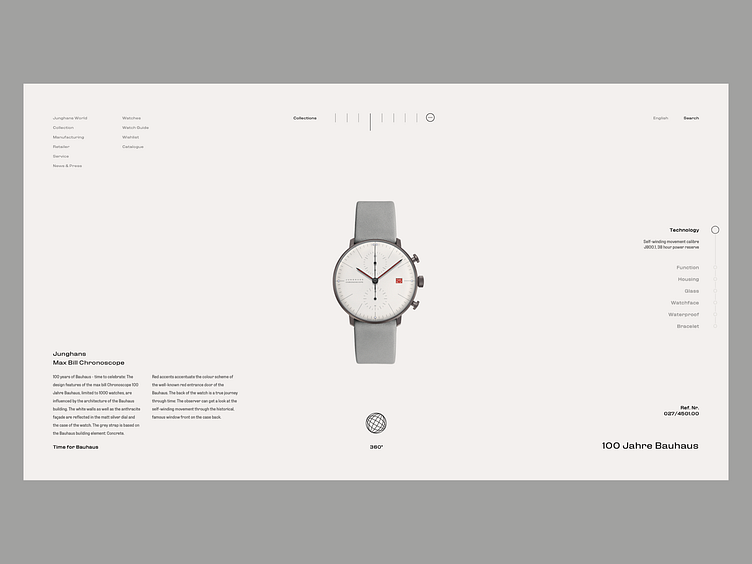
Watch Ecommerce Site - Product Page
Watch dials are all about grids and balance. I tried to convey that with the product page.
The idea was to keep the watch product image as clean as possible so you can take a good look at it. You still have all of the cool info about the craftsmanship that went into creating the watch but its a bit more discrete.
What do you think?
- SOCIAL MEDIA - Instagram - Behance - Say Hi - hi@unick.co
More by Nikola Uzunov ☛ View profile
Like
