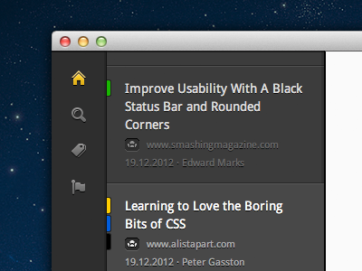
Better sidebar?
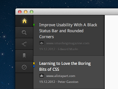


I wasn't satisfied with the plain sidebar (used in quite a few apps nowadays), so I added a more app-like feeling to it (Inspired by the latest work of @Mikael Eidenberg. Awesome stuff.). Is this for the better or worse?
Archived articles are now darker & have no label anymore. The labels got smaller & not so distracting.
Be sure to check out the 2 big screenshots. One is with the collapsed article list. This is the normal view you would have if reading an article.
The icons need a bit more love, but that has to wait until tomorrow :).
What do you think? Am I taking it in the right direction?