Words App Remake UI
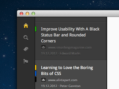
Quite satisfied now with the sidebar UI. What do you think about the colour indicators? Green = unread article, yellow = article with marked text, blue = article with custom tags, black = archived article.
I wanted to find a non-intrusive way of indicating these different article states. It took me a while, but I am quite satisfied now. They make the app feel a bit more lively, but don't piss you off after a while. As far as I see it. What do you guys think?
For the big picture, check out the full screen attachment.
The article view on the right isn't anywhere near final so far. So don't be to hard on me with it.
More by Sven Read View profile
Like


