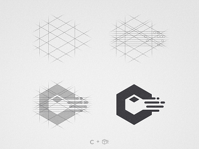
Click and Easy - Logomark Design
Recently i worked with Click & Easy in order to develop a new logo to replace their old one.
Click&Easy is a business that develops software for delivery companies, so i created a C lettermark with a moving box on it's negative space 📦💨
Was this a good rebrand?
Recently i worked with Click & Easy in order to develop a new logo to replace their old one.
Click&Easy is a business that develops software for delivery companies, so i created a C lettermark with a moving box on it's negative space 📦💨
Was this a good rebrand?
Old Logo.png
80 KB
More by Wisecraft View profile
Like


