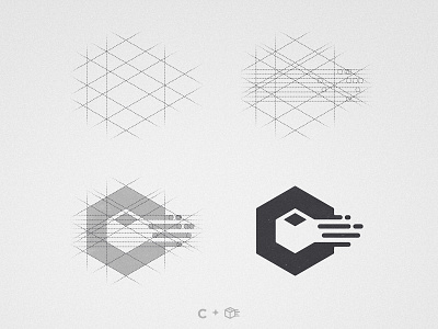
Click&Easy - Logo Grid
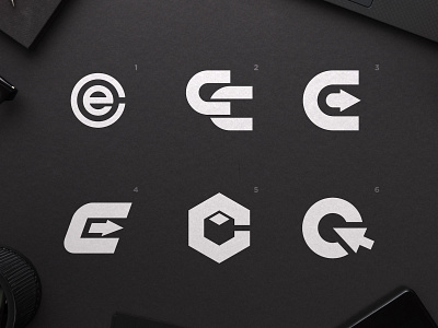
Yet another option for Click & Easy, the client requested to see more variations of last post's concept 5 but with a focus on conveying fast and better consumer experience 📦💨
That's the reason i decided to add those morse shade lines to convey a fast movement of the package. What's your thoughts on them? Should we keep them or take them out for the final version of the logo?
--
📨 Got a project? Let's work together! Email: wisecrafted@gmail.com
--
More by Wisecraft View profile
Like

