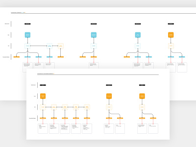
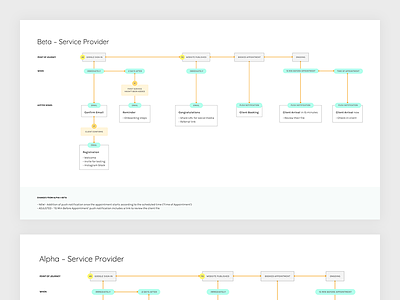
Beta Communication Chart 2.0
Here's a follow-up to my initial shot here with an updated version of our communication chart. If you're wondering what it's like to work full-time at a start-up as a Designer, it's less shiny than you think. A lot of it revolves around growth initiatives which often includes tons and tons of emails and many communication touch-points.
As our product matures, we need to add more and so the chart grows to accommodate: emails sent from three platforms, push notifications, and SMS... to two different types of users.
This type of documentation becomes rather untenable at a certain point, I'd imagine. The team is still small enough for this to be useful for me and to ensure that we cross the T's and dot the I's.
I've attached the full-screen if you want to take a look since I didn't include them last time.
--------------------------------
Tools used to create this:
Figma
Adjusted version of @MDS Flowkit (Purchase here)


