Symposia Dashboard
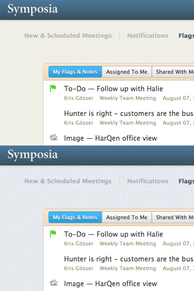
This is a rebound to show what I mentioned in the original's comments. The first five seconds are the existing dashboard for Symposia. It uses a background similar to Basecamp. The next five seconds are the original color scheme which was more of the noisy soft blue. It's remarkable how much better the manilla tan background makes the interface.
More by Kris Gösser View profile
Like

