Symposia Dashboard
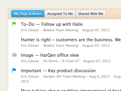

I really enjoy how the Symposia dashboard came together. This is the list of past entries. (https://symposia.harqen.com)
I must admit: it turned out similar to the base Basecamp. The story on that is I had much the same layout—header, nav, search, white islands with 3px rounded corners, shadows—but a soft blue color taxonomy. It was interesting to me how similar we were upon the BCX redesign, and after changing up my background to the soft green-yellow they had, it was remarkable how much better the interface was, so I went with a similar background instead.
I'll add a rebound that animates between the original and existing to show the transformation.