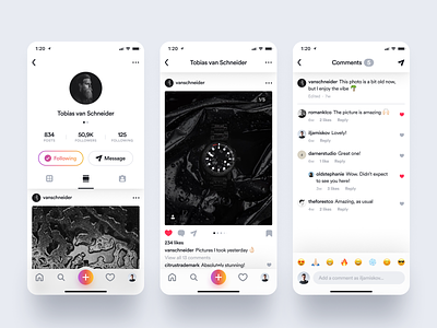
Instagram Photo Page & Comments
Hey!
Today I'm giving you some more juice on the Instagram redesign I'm doing.
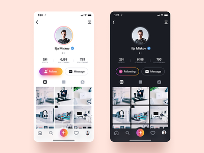
First, I was able to improve the look and feel of the profile page and got some things fixed from my previous shot. Overall the design feels much more consistent across the screens.
Then I also made the list view screen for photos. I gotta say though, I didn't want to move too far away from the current Instagram user experience so I left a lot of things untouched, like the look of the comments section and it's hierarchy. I made some visual changes though, like adding more generous padddings here and there, giving these screens new icons and the comment field itself is now looking different.
Check out the fullsize & let me know what you think down below! 🙏
----------
I used my Ultimate Designer Mockup Pack for this shot. Go check it out! 😉

