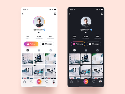
Instagram Profile
Hey!
So I decided to do a little revamp of the current Instagram app interface, and this is the first little piece I wanted to show.
The first thing you can notice is the inclusion of a dark mode. I've honestly been waiting for this feature to come for a long time and I think that every big app developer should let their users choose whether they want to use Night Mode or not.
I also completely remade the actual profile card. The current one while saving a lot of vertical space feels too noisy and outdated to me. So I gave it a shot and made everything more 'airy' and balanced. And in my opinion this type of UI looks much better with the latest iOS and modern mobile devices.
Some other things involve redesigning the icons (I am still torn between using filled and outlined icons in some spots), adding paddings to make better separation of the elements and some color changes as well.
Let me know what you think down below! 🙏
----------
I used my Ultimate Designer Mockup Pack for this shot. Go check it out! 😉
