"Pick a path" CTAs - A/B Test
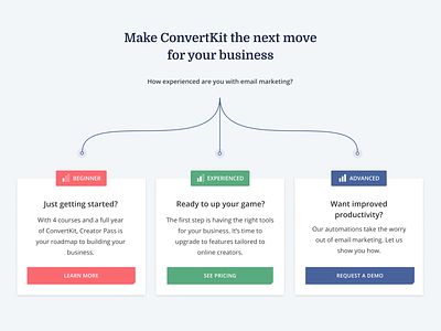
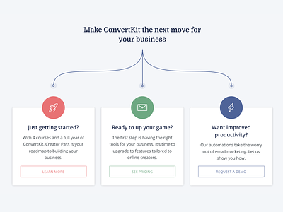
This is version 2 of the 'Pick a path' at the bottom of the ConvertKit homepage, which we're currently A/B testing.
In user tests people sometimes weren't sure which path to pick, and there was feedback that the hollow buttons weren't prominent enough, so this updated version clearly labels each path as beginners, experienced or advanced and has filled in buttons.
The test is still in progress but current results show slightly less clicks overall than the original version for some reason, but that more people are clicking through to what we determined was the right path for them.
Still lots more tests to run for this homepage CTA section, it's fun to learn from the data 🤓
More by ConvertKit View profile
Like

