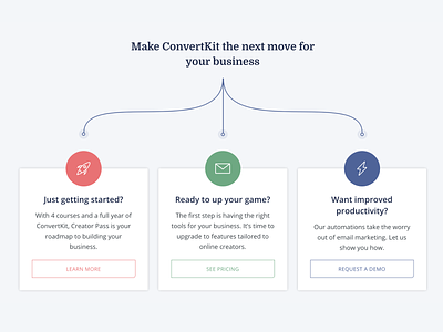
Homepage "pick a path" CTAs
A challenge I faced with the new ConvertKit homepage was that the 'next step' is different depending on a creators experience with email marketing. To deal with this I designed this 'pick a path' CTA section at the bottom of the page.
I've got a few small things I want to change about this based on user testing, but wanted to share this initial direction.
You can check it out in situ here: convertkit.com
More by ConvertKit View profile
Like
