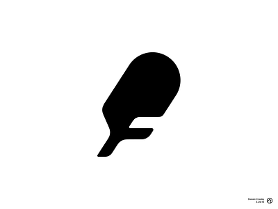
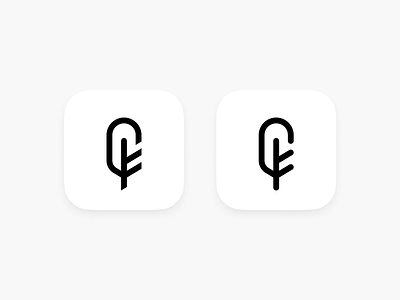
Feather Logo
Similar shape and concept as the previous versions, but liked the bolder look of this one. Feels less like an outline icon and still conveys a subtle letter F.
Still playing around with the curves and angles but welcome any feedback.
More by Steve Crosby View profile
Like

