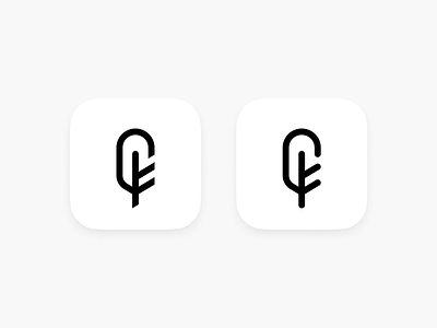
Feather Logo Style Test
Open to feedback. The letter F is essential to the brand so this will help determine how to move forward with a custom word mark.
Update: Attached a comparison of the bottom right corner as brought up by @Mathijs
Do you feel like this balances the mark better or does it end up sacrificing the F too much? The wordmark would use the typical F shape found in any basic san-serif.
More by Steve Crosby View profile
Like

