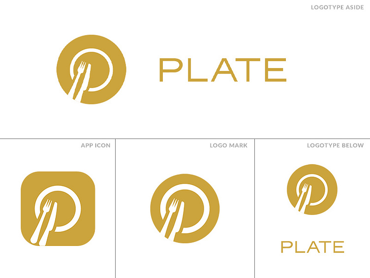
Plate Logo V2
So here's the second iteration of the logo. A sleeker design for a more elegant brand, which is what we were looking for. Firstly, "finer" cutlery in the logo, sleeker lines and a more elegant. All-caps seemed to work pretty well here for the logotype.
More by Jeroen Rood View profile
Like

