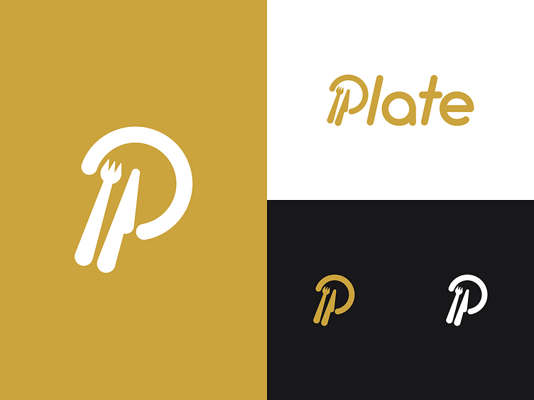
Logo exploration Plate
Working on a very cool concept that I will show you later. It's called Plate, and will focus on high dining enthousiasts. Here's a logo exploration, along with a logotype and colors represented in the style of the concept.
So how did I get at the logo? Well.. I wanted to express a certain culinary meaning to the logo, and couldn't help seeing a capital P in cutlery on a plate! :)
The color theme was a bit of a process. We started out with bright, fresh colors, going from light themes to dark themes.. But we ended up with a light theme as a basis, with an "eerie black" as dark counterpart and a gold shade as accent color.
Stay tuned!
More by Jeroen Rood View profile
Like
