STUDIOJQ Behance prosite update (June 2012)
STUDIOJQ Behance prosite update (June 2012)
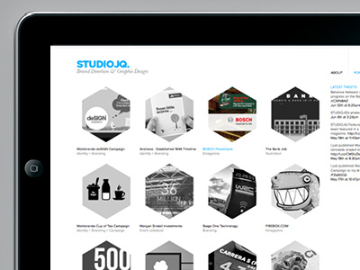
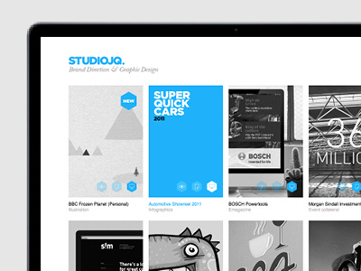
I have tweaked the thumbnail shape to a hexagon (taken from my previous branding). I wanted to make my site a little more interesting, so have adapted the shape of the thumbnail to make the project image more intriguing.
It is only a 'tweak' but I think it has improved the look and feel.
More by MadeByStudioJQ View profile
Like


