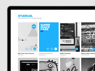
STUDIOJQ - Website update (Dec 11)
STUDIOJQ - Website update (Dec 11) Working on my behance prosite website, I have now tweaked the blue, as the green before was abit too moody. I feel this blue is much more fresh and electric, now the roll overs are simple with some typography to compliment the project.
I was very happy that this was published in the Behance prosite of the month newsletter.
I prefer this style. Thoughts?
More by MadeByStudioJQ View profile
Like

