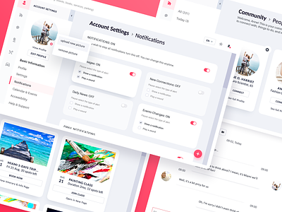
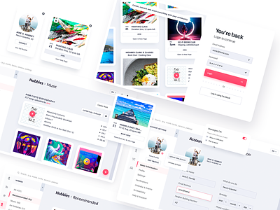
Neighbor.app : Community & Settings Panels
👋🏻 Happy Friday, guys!
Told you I'll get back with more info about the Community App for Seniors 😀.
Intro about this project (previous shot)
I'll jump straight to the analysis results from the mixed research data (qualitative & quantitative), just a couple of items. I will also publish how I got to these results in a future post.
Brief
Community connection app for seniors
A Web dashboard that connects residents who live
in the same private community.
Target audience & starting point requirements:
Seniors (60+)
Some of the key functionalities of the platform are to provide an easy way for residents to: connect and communicate with each other, book a parking space, stay informed about community events, and complete their basic profile.
Analysis results (based on interactive interviews/ colors samples/ reading test and others)
It's more about personal preferences, medical condition & human behavior, language, needs, fears, etc.
▪️ Colors: never blue (weak sight - distortion), pink coral preferred (warm, positive, readable, pleasant)
▪️ Min Font size: 16px
▪️ UI elements: avoid complex features and actions, pictures preferred above all other graphics, avoid too many icon buttons
▪️ Navigation: easy, straightforward action flow, one ax display navigation (Vertical/horizontal), limited gesture control and button states, accentuated scroll navigation bar (hard to pinch if they’re too thin). Repeated content modules recommended with generic text action buttons.
▪️ Help/care/support: easy to find support at all times (subtle), action notifications with the possibility in reverting actions/ cancel/ approve
▪️ Options & features: Social (connections/chat), profiles (customize & publish experiences), news & events, facilities (parking, medical care etc), calendar/schedule, my favorites - all in one place.
▪️ Users: language, behavior type & characteristics ( will add the structure in my next post)
▪️ Resolution (screen) 1366x768
Solution Principles (keywords)
▪️ easy to use
▪️ positive look & feel
▪️ clear & short instructions
▪️ variety of activities
▪️ 3-5 action steps
▪️ accesibility
▪️ connectivity
Thanks for taking a looky 🧡, see you s(p)oon!
❔ Questions? Fire away!
--
We are available for projects
Estimate your project at teamuinugget@gmail.com


