Neighbor.app : Community App for Seniors
Hi there 😉!
I recently was challenged to create a full study scenario for a given product concept and design a couple of screens based on those results. This included research, strategy, user flows, wireframes, and the final design.
It ended up being a massive project for me, had some revelations about our generation of designers 😱 (I'll be back with insights on this in my next post), what happens when we focus too much on our target and forget about everyone else, and tons of new things about senior users & their needs.
◼️ Brief
Community connection app for seniors
A Web dashboard that connects residents who live
in the same private community.
◼️ Approach
While this part is normally based on an intense collaboration with other teams, as a solo explorer I had to start creating the project structure and everything 😵 I wanted to include as documentation and design components and start putting those pieces together.
◼️ The challenge
A community app of this caliber offered plenty of opportunities to explore and go around. It was very difficult in choosing only certain features and prioritize them above others.
Part of the requirements included: Social-communication part - translated into user profiles, connections, voice/video chat, messages, customizing tools, Things to do/hobbies: online games, art galleries, music (upload/listen), read books, and many more.
◼️ About this shot
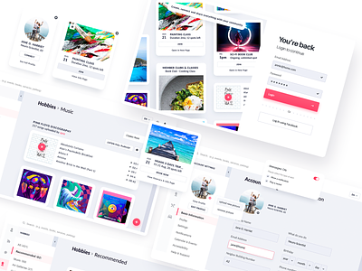
These few exploration screens managed to check off some items of my concerns list. I was worried about showing too much content, showing too many actions, not being self-explained enough etc. With vertical navigation and repeated card style modules which hold the same primary and secondary principle actions, and grouped menu options- our modern seniors can get used with the application quickly and understand what they need to do, to perform certain tasks.
There's a lot more to share, I'll be back!
Thanks for passing by 😘
--
We are available for projects
Estimate your project at teamuinugget@gmail.com

