Sigo Seguros
Huy guys,
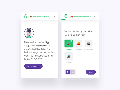
I wanted to share some shots of this fun project that I worked on a few months ago for an online insurance company.
.
🔎 The main problem we were trying to solve: Users were dropping the process of getting a quote. After some testing, we realized the questionnaire was extremely boring, long, and it didn’t provide the user with any categorization nor a clear understanding of the progress.
.
💡The most appealing solution was: An interactive bot-like questionnaire, a personal assistant facilitating a friendly conversation and a bunch of emojis to make it more fun and familiar. The new solution had a clear categorization of the “get a quote” process dividing the questions into 3-4 main sections.
.
💰 We developed and tested a functional prototype and after its launch, the increase in conversion rates improved considerably, and a bigger number of users were able to complete the get a quote process. The final solution is still in development.
.
The tools I used:
🖋 UX Strategy, flows, and documentation: Dropbox Paper.
💎 Wireframes and Visual Design: @UX Store pads and Sketch.
👩🏻 Animated prototype and avatars: Principle.
.
Make sure to see the behind the scenes in my Instagram page: https://www.instagram.com/jasonfallas/


