East Coast Surf Co.
The founders of East Coast Surf Co. wanted a brand that would stand out from the already crowded surf industry - a simple and standard wave design just wouldn’t do.
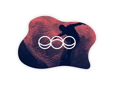
I started off my design process by breaking down surfing into several key concepts: ocean, tides, balance, and focus. This approach eventually led me to a key symbol: the moon.
From this, I designed a logo which the moon phases create the ebb and flow of the water. A unique, new, and memorable take on surfing as a whole.