Get Wheels. Application Layouts
Hey dribbblers,
We know how stressful the vehicle buying/leasing process can be, left alone if you never even driven your own car before! Sweat no more, GetWheels makes car renting/leasing/buying as easy as it gets. Get a car for a weekend in seconds. Want to lease? Calculate, schedule test drives, apply and make base payments in a matter of minutes. Finding/connecting with a car owner has never been easier during the buying process. I’ll go from the pixels to the interaction and motion.
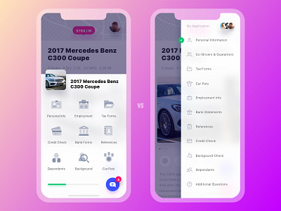
This shot is basically a comparison of different layouts I contemplated for the application page. The left one is sure more graphic and clear if you ask me but the right one is more scalable for the content. Given that the application sections may vary for different cases, we decided to go with the right one b/c of how flexible a list is. Even if we were to keep stacking items in the left one the grid would break as soon as the total number of items couldn't be divided by 3 so here we go.
Stay updated, there’s always some more slick stuff to come.
Cheers!


