Perpetual Simpler
My friend Bryan was asking for help designing an interface for looped music playback. I'm not the target user for this at all, but here goes.
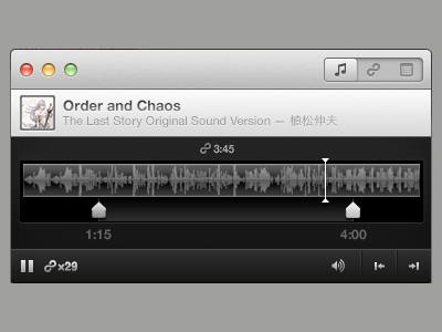
In the two latest concepts, I was struck by how many time indicators there were to decipher: five and seven.
I rationalized that if I'm only playing a trimmed portion of the song these are true:
1. I don't care how long the song is. 2. I don't care where playback currently is. 3. I don't care how long I've been playing 'Twilight and Shadow' on repeat. No matter how beautiful Renée Fleming's vocal is.
So I cut down the time indicators to three.
1. Start position 2. End position 3. Loop duration
It makes sense to me to put the start/stop times directly under the sliders they reference. This makes the waveform wider (more precise selection) and you can click the time to edit manually.
I jammed the loop time above because the interface won't collapse if I import a 190 minute Moby live rave, but only want to loop minutes 50 to 51. Keeping it between the markers looked nicer, but could fail.
I also rammed the pause button and loop counter to the bottom left for easy access. I didn't know what the 'plus file' button did so I removed it (assuming you could drop a file anywhere to switch). I also moved the skip to start/end buttons to the right, but I find this confusing. Probably I'd remove these too. I don't know why they're useful.
So I hope my blunt surgery helps.

