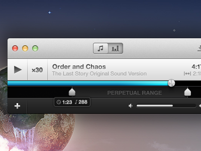
Perpetual Experiments
If you caught me on Twitter today, I was asking a fewquestions about the importance of certain user interface elements in a music app. Reason being? I hit a brick wall because of one feature.
That feature? The ability to manually input times for the markers in addition to dragging the slider handles. The problem came about when I wanted to add labels to the play/range area while not losing the style I had already set.
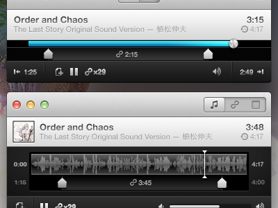
At the top, I tried throwing two buttons on either side of the footer bar, but it felt a bit crowded. Unintuitive? Maybe, since the buttons sit far enough away from the range selector.
The bottom is my most recent attempt: completely going back to the drawing board, even going as far as implementing a waveform view as the default play range. Harder to implement? Yeah, most likely.
I'd love to get some feedback on this one, as I'm still not to sure as to which direction I should take. Maybe I'll sleep on it. Also, there are a few other changes in here that I'm sure you'll take note of. :)
(The farther I get into this project, the more respect I have for desktop application designers.)