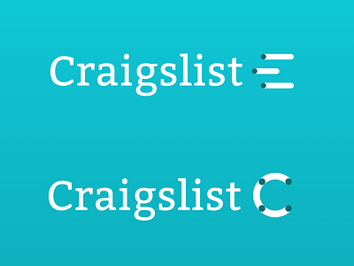
Craigslist v3
For this stab at the Craigslist logo, I went more abstract, just playing with the C shape and what I could put around it. Overall it's more abstract than anything, but I felt that the bars were representative of a list, tying in the wholeness of the name.
Thoughts? Feedback? Does this look better or worse than my previous attempts? Conceptually is it better or worse?
More by Shane McKnight View profile
Like

