Craigslist Logo, additional thoughts
A couple more attempts at a Craigslist Logo based on the feedback I got from my original version. One suggestion from my original idea was to narrow it down from 4 icons to 1 so it's cleaner as well as more readable in smaller versions, however I find that really difficult to do considering that Craigslist does so much.
Along with buying/selling/trading things, Craigslist offers event postings, job postings, services, discussion forums, etc. The best way I could sum up Craigslist, if you're considering all of those other offerings is connectedness with people, or more specifically, interactions between people.
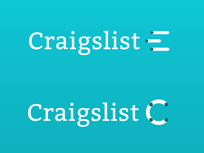
The first of the two iterations here was a play on the "list" part of Craigslist, resembling a bulleted list, and somewhat creating the curvature of a C. I'm not super sold on this version, but thought I would included it for feedback/thought process.
The second of the two iterations is obviously a C for Craigslist, with the dots representing anything from people to goods all being connected across the C. I think this version better represents what Craigslist is and does, although I'm not sure if it's executed in the best way possible.
Any thoughts or feedback? I would love to hear anything that might be obvious that I'm missing.

