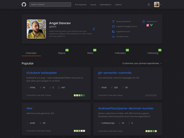
Github Dark Preview
Here's a preview of a dark themed GitHub redesign of the profile page that I've been working on lately.
I've restructured the layout a bit, which makes it easier for the user to scan the content. As you can see, the profile card is now at the top maintaining a better vertical rhythm with the overall layout.
There are still things to polish out, before I make it a full release.
Show some love, y'all :))
Cheers!
More by Angel Davchev View profile
Like

