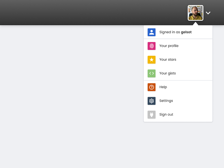
GitHub Dropdown
I've been working lately on redesigning some of the current GitHub experience, as well as adding new features that would improve it.
Here's an example of how I imagine the profile dropdown menu. I've added icons next to the links in order to break the monotony of textual only information. The color grabs the user's attention and prompts action. Furthermore, they add even more explanation of the links purpose.
I hope you enjoy this shot. Show some love if you do 😊😊😊.
More by Angel Davchev View profile
Like
