Promo Page Design Animation for a Fashion Platform
Yo!
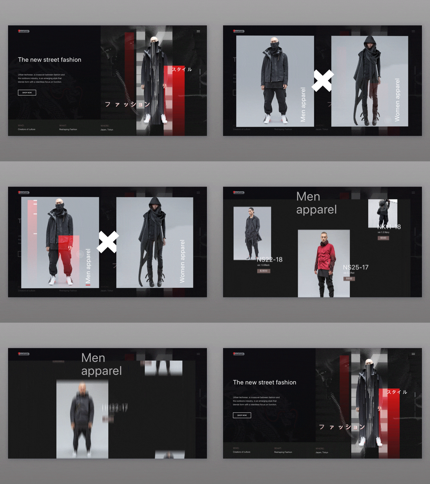
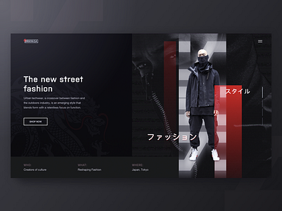
We keep on experimenting on the website for a cool Japanese fashion platform here at Zajno. Last time Kostya Vargatiuk shared only the first screen of its promo page. Now we’re ready to present the entire promo page. I decided to animate it to give you a clearer picture of how users will interact with the page.
Join our Newsletter for more inspiration!
Goals
Creating a stylish website design to present the company’s product. We tried to reflect the brand’s urban mood and find the best design approach to represent its innovative nature, as it’s essential to connect with the target audience.
Approach
To better reflect the brand’s industrial style, I played a bit with the geometry of layout and broken grid, so that it slightly reminded the urban fabric. I used black-and-white color palette with some red elements because these are the brand colors, moreover, they’re the best match to the style. I also used some catchy visuals and Japanese patterns to give a clear picture of this fashion platform’s aesthetics.
Results
What we ended up with is a clean and elegant promo page design animation that reflects the company’s stylistics and speaks to their target audience.
Are you digging the design and the animation? Can’t wait to hear from you!
Press "L" to show some love!
ᗈ Join our Newsletter!
ᗈ Website
ᗈ TheGrid
ᗈ Spotify
ᗈ Twitter
ᗈ Medium
ᗈ Facebook
ᗈ Instagram

