Promo Page Design for a Fashion Platform

Hey folks!
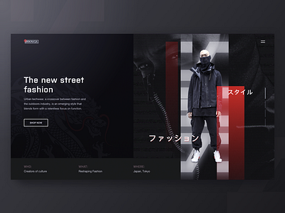
Here at Zajno I’ve been experimenting lately on a website for a cool Japanese fashion platform that presents a new clothing style - urban techwear, a blend of form and function, fashion and outdoors industry. This is the website’s promo page design I came up with, and as it’s only the first version of it, I decided to share it here to find out what you think of it. Maybe you have some suggestions or recommendations? I’d be really thankful if you shared them with me :)
Goals
Creating a stylish website design to present the company’s product. We tried to reflect the brand’s urban mood and find the best design approach to represent its innovative nature, as it’s essential to connect with the target audience.
Approach
To better reflect the brand’s industrial style, I played a bit with the geometry of layout and broken grid, so that it slightly reminded the urban fabric. I used black-and-white color palette with some red elements because these are the brand colors, moreover, they’re the best match to the style. I also used some catchy visuals and Japanese patterns to give a clear picture of this fashion platform’s aesthetics.
Results
What we ended up with is a clean and elegant promo page that reflects the company’s stylistics and speaks to their target audience.
What’s your thoughts about it? Again, if you have some advice or suggestion, be sure to share it. I’m all ears!
Don’t forget to follow Zajno on social media and feel free to drop us a line:
Website | TheGrid | Twitter | Instagram | Medium