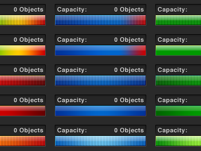
Capacity Meter Color Test
Working on my Lucid Chart redesign some more. Testing different color options for the complexity meter, which I've renamed "capacity" to help better explain what it does.
Still not sure on the style yet, or whether or not I should show the individual item increments or not. Having said that though, I'm pretty sure I want to go with a dark theme for the overall design.
Full selection in the attachment :)
More by Tyler Corbett View profile
Like


