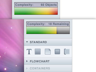
Lucid Chart Brainstorming
I got frustrated with Lucid Chart today at work, so I decided to spend my time looking at it from a usability stand-point and seeing what can be improved in the lovely little web app. The goal here is to increase the usability as well as polish up some of the interface elements.
This is just a quick & dirty digital rough of some ideas I had today. A lot of this will change as I progress (especially the Finder design style, which is only a temporary look).
Everything is hand-crafted by me except for the Aurora background. I plan on doing a full study with this, so look forward to seeing more improvements to this in the future.
More by Tyler Corbett View profile
Like
