Homepage Main Screen Animation for a Travel Agency Website
Hi guys!
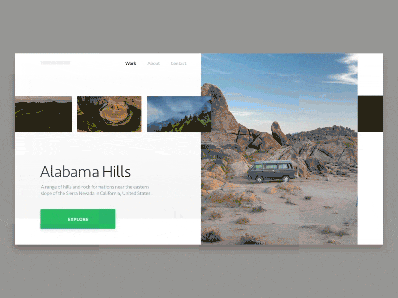
I’d like to present another version of the homepage main screen I came up with for the website we’re designing here at Zajno to help a rad travel agency make your wildest travel dreams come true. I shared the first version of the homepage the other day, and then I put together a new one in an effort to find the best solution for the homepage main screen slider. So I’ve got a question to ask and I’m pretty sure this is the best place to do it. Some advice from Dribbble Community is the very thing I need! So here's the question: which main screen slider is better: the first or this one? I’d be really thankful for your help!
Goals Presenting the travel agency to the public creating a lovely, stylish design that matches their nature.
Approach In this version of the main screen slider, I tried the pixel stretch effect to see if the overall design benefits from it. As in the previous version, I used picturesque, tempting visuals that are softly whispering in your ear: you wanna come here, you wanna breathe this air and go wild! Tried to make it really easy to explore all the destinations, making user experience really nice.
Results I ended up with another version of the homepage main screen which may or may not be the best solution we’re looking for. Personally I think it came out pretty stylish and smooth. But what I really want to find out is what you think about it, and which one you like more: the first version of the homepage or the second? Share your thoughts in the comments, I’d really appreciate it! Now I’m all ears! :)
Press "L" to show some love!
ᗈ Join our Newsletter! ᗈ Website ᗈ TheGrid ᗈ Spotify ᗈ Twitter ᗈ Medium ᗈ Facebook ᗈ Instagram