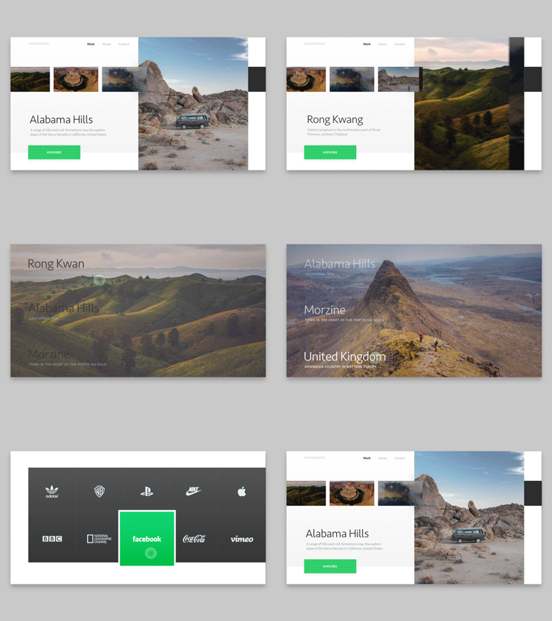
Animated Homepage for a Travel Agency Website
Hey there!
Today we’d like to share the website homepage we are currently designing for a nice travel agency. I mean, isn’t it nice? Just look at it, look at the great destinations it offers - just awesome, I’d love to visit them all. But that’s not the point :)
Goals
Our main objective was to present the travel agency to the public creating a lovely, stylish design that matches their nature. We animated the page to show how interaction design can benefit the overall user experience, adding more life to it and just making it look darn awesome!
Approach
We used picturesque, tempting visuals that are softly whispering in your ear: you wanna come here, you wanna breathe this air and go wild! We used subtle animations to add smoothness to the elements transitioning. Tried to make it really easy to explore all the destinations, making user experience really nice.
Results
You can see above what we came up with. Think it came out pretty stylish and smooth. Check it out, I’d like to find out what you think of it! Don't be shy!
Press "L" to show some love!
ᗈ Join our Newsletter!
ᗈ Website
ᗈ TheGrid
ᗈ Spotify
ᗈ Twitter
ᗈ Medium
ᗈ Facebook
ᗈ Instagram
