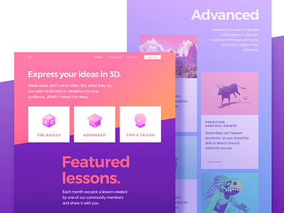
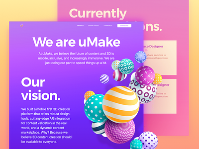
Learn Page for an iPad 3D-Sketching Platform Website
Happy Friday guys!
Looks like the week is almost over, huh? We’re keeping on sharing with you the designs we created for our friends at uMake all the way in San Fran. uMake is an iPad 3D-Sketching Platform, an app with robust design tools an cutting-edge AR integration for placing your creations in the “real” world. The main objective of the website we created for uMake is not only to tell potential users about the product’s benefits, but also to teach them how to sketch in 3D using the app. The page you see above is the Learn Page and it teaches all levels of 3D sketching. You can check out the live version of the page here.
Goals As uMake is a new product, it’s essential to teach people to use it so that they could see for themselves how easy and useful it is. The page provides 3 levels of 3D sketching tutorials to appeal to all target groups and help them hone their skills.
Approach Our main focus was to present the app’s innovative nature using vibrant colors and bold typography as that was one of the requirements. Another task was to use lots of heavy graphic content and it was a real challenge to make it all load smoothly without affecting the usability of the website too much. The overall style was defined together with our client according to the moodboards we created.
Results We ended up with a vibrant, visually rich Learn page that teaches how to use uMake’s mobile application providing users with all the tutorials and featured lessons they need to express their ideas in 3D.
Love hearing from you guys! Share your feedback and have a marvelous weekend!
Press "L" to show some love!
ᗈ Join our Newsletter! ᗈ Website ᗈ TheGrid ᗈ Spotify ᗈ Twitter ᗈ Medium ᗈ Facebook ᗈ Instagram


