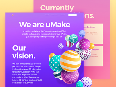
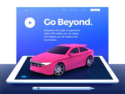
About Page for an iPad 3D-Sketching Platform Website
Sup peeps?
Check out another page I designed for uMake, a cool mobile 3D-sketching platform with AR functionality. What you see above is the About page of the website we created here at Zajno to help the guys tell a story about the product they made. Their app offers robust design tools, cutting-edge AR integration for placing your creations in the “real” world, and dynamic content marketplace. Not to mention, a pretty big community of awesome 3D designers that are connected through the app. Nice. BTW, the website is already live, you can check out the page here.
Join our Newsletter for more goodies!
Goals Creating a top-notch website that would introduce uMake’s innovative mobile application to the public, showcasing its main advantages and features and conveying the idea of its simplicity and usability. One of the requirements was having bold typography and vibrant colors, pretty much screaming at ya. But in a good way, you know. Not to mention - the content displayed on the website was created in the app and was provided by the client.
Approach Our main focus was to present the app’s innovative nature using vibrant colors and bold typography as that was one of the requirements. Another task was to use lots of heavy graphic content and it was a real challenge to make it all load smoothly without affecting the usability of the website too much. The overall style was defined together with our client according to the moodboards we created.
Results What we ended up with is a vibrant, visually rich creative page that introduces uMake’s mobile application to the public, showcasing the app’s main benefits to prove users it’s exactly what they need to reinvent their creativity.
I love it so much when you speak your mind! Don’t be shy!
Press "L" to show some love!
ᗈ Join our Newsletter! ᗈ Website ᗈ TheGrid ᗈ Spotify ᗈ Twitter ᗈ Medium ᗈ Facebook ᗈ Instagram


