AR Page for an iPad 3D-Sketching Platform Website
Hey folks!
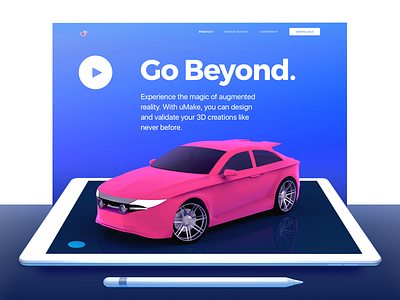
What’s up? Hope you are doing great! I’m feeling really good today, and I’d like to share a hero shot I created here at Zajno for some cool guys from San Fran. I’m talking about the guys from uMake, a cool mobile 3D-sketching platform with AR functionality. What you see above is a part of the AR page of the website we designed and developed for them. We were really happy to help the guys tell their story about the product, ‘cause it’s pretty rad! BTW, the website is already live, you can check out the page here.
Goals Specifically, with this page, we had to tell a story about the AR part of the app, which allows folks to sketch something and then put it into a real environment and see whether it fits there (or maybe should have stayed just as a sketch, on their iPads). We also had to describe the fact that these sketches can be sent to others via the app. Imagine getting a cool AR Birthday card, made by your friends especially for you?
Approach Since many users of the app use it for sketching vehicles, we decided to use one as the main visual element at the top of the page. You can sketch a car and put it straight to your garage, free of charge (almost). We thought it would be best to show examples, and so we did. We combined layers and allowed site visitors to interact with them, transforming a sketch in the app into a robot in the real world, simply by sliding their mouse.
Results We have a page that is consistent with the entire website, telling a story about how the app users can benefit from utilizing the AR functionality of uMake. There are also examples of how it can look like, so there is no confusion. I believe that’s pretty much it.
Wonder what you think about it. Share your thoughts! Don't be shy!
Press "L" to show some love!
ᗈ Join our Newsletter! ᗈ Website ᗈ TheGrid ᗈ Spotify ᗈ Twitter ᗈ Medium ᗈ Facebook ᗈ Instagram


