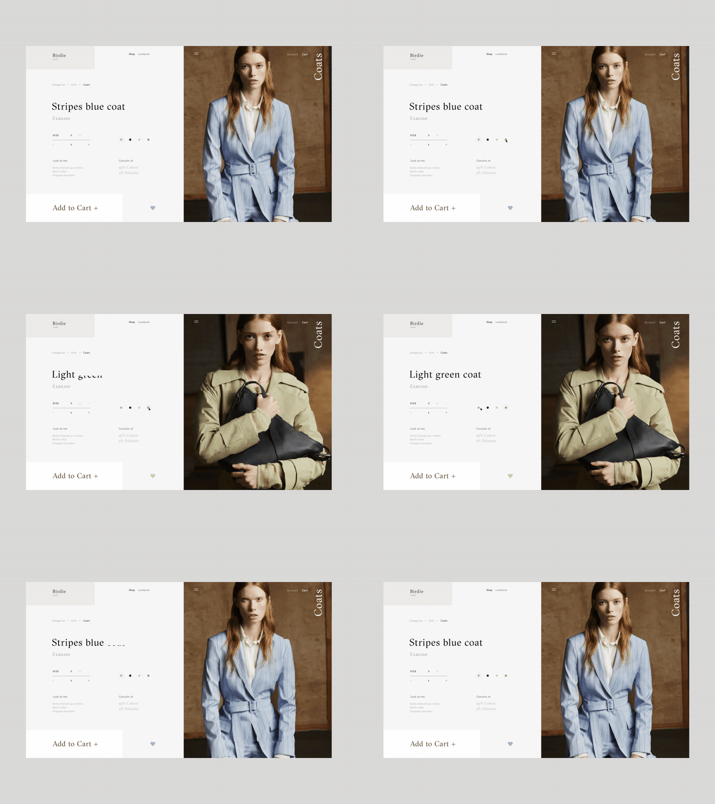
Birdie Fashion Store Coats Product Page Animation
Hello friends,
This is a new animated shot from me on the fashion e-commerce store called Birdie. Today, it is a Coats product page. As always, the key focus is of course on the CTA, which is both prominent and appealing, isn’t it?
My general objective with the design was to play with the geometry of layout and whitespace. The animation was created respectively to support the overall look and feel as well as to make the page stand out.
I think it came out pretty stylish. Eager to hear your feedback!
Cheers :)
Press "L" to appreciate it
More by Synchronized View profile
Like

