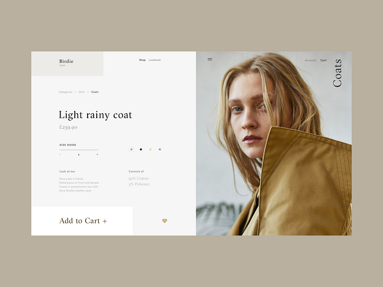
Birdie Fashion Store Rainy Coat Product Page
Hello friends,
This is a new shot from me on the fashion e-commerce store called Birdie. Today, it is a Product Coats page. As always, the key focus is of course on the CTA, which is both prominent and appealing, isn’t it?
My general objective with the design was to play with the geometry of layout and whitespace.
I think it came out pretty stylish. Eager to hear your feedback!
Have a great week :) Cheers!
P.S. Check out my first interview on Muzli about my design thinking school, working process and motivation.
Press "L" to appreciate it
More by Synchronized View profile
Like

