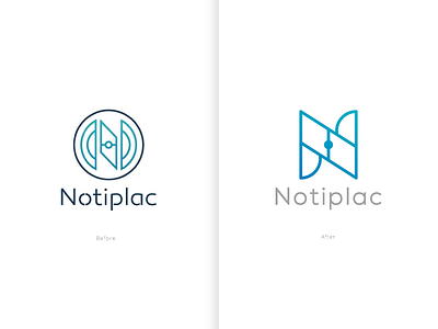
Brand Redesign (Car Controller App)
(Startup) Right here you can see the variations of the new proposal, more clean and unifying the shapes, that's very important for me because you can't perceive it in the old logo.
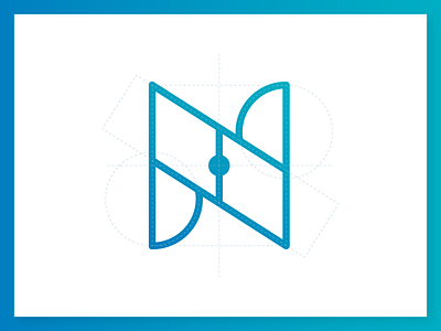
It's a brand for a mobile app from my city, looks very simple, I like this geometric construction, how ever you can see, I'm using only 4 primary shapes on this structure.
A good design always can be better
what do you think?
More by Kiddo™ Estudio View profile
Like

