Logo Guidelines
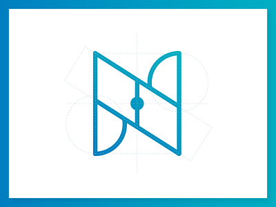
This is preview from a very nice Redesign project that I made, it's a brand for a mobile app from my city, looks very simple, I like this geometric construction, how ever you can see, I'm using only 4 primary shapes on this structure.
what do you think?
More by Kiddo™ Estudio View profile
Like
