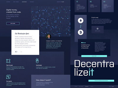
Website Design for Blockchain Payment Platform
Hey there!
The page you see above is a part of a little strategy we developed here at Zajno while working on the website for a blockchain payment platform.
Goals
The idea was not to overwhelm a user with a ton of information all at once as others often do on their homepages telling all about cryptocurrencies and going into detail. The problem of this solution is that when too much information is thrown at users, the main idea can be lost upon them, leading to frustration. Sure thing, it won’t contribute to retaining users - most probably it’ll scare them off. That’s why we decided to create a separate Internet resource that would educate people about the basics of blockchain payments and cryptocurrency exchange where we’d share a link to our clients’ website just to provide an example (“Learn more” button).
Approach
Having studied the market and the existing platforms we divided the target audience into two groups: tech-savvy people and newbies in the field. That’s why we actually came up with the solution of dividing information into two “levels” to appeal to both groups. In terms of design our objective was to play with composition and layout to find a more unconventional approach to both of them. The main challenge was to keep the focus on the main elements of the page.
Results
The clients agreed and preferred our solution to the usual way of providing information, so we ended up with a stylish and effective UX design that best serves the needs of the target audience allowing our clients to attract and retain more users.
Eager to hear your feedback!
Press "L" to show some love!
ᗈ Join our Newsletter!
ᗈ Website
ᗈ TheGrid
ᗈ Spotify
ᗈ Twitter
ᗈ Medium
ᗈ Facebook
ᗈ Instagram


