Education Page Design Animation for Blockchain Payment Platform
Happy Monday, guys!
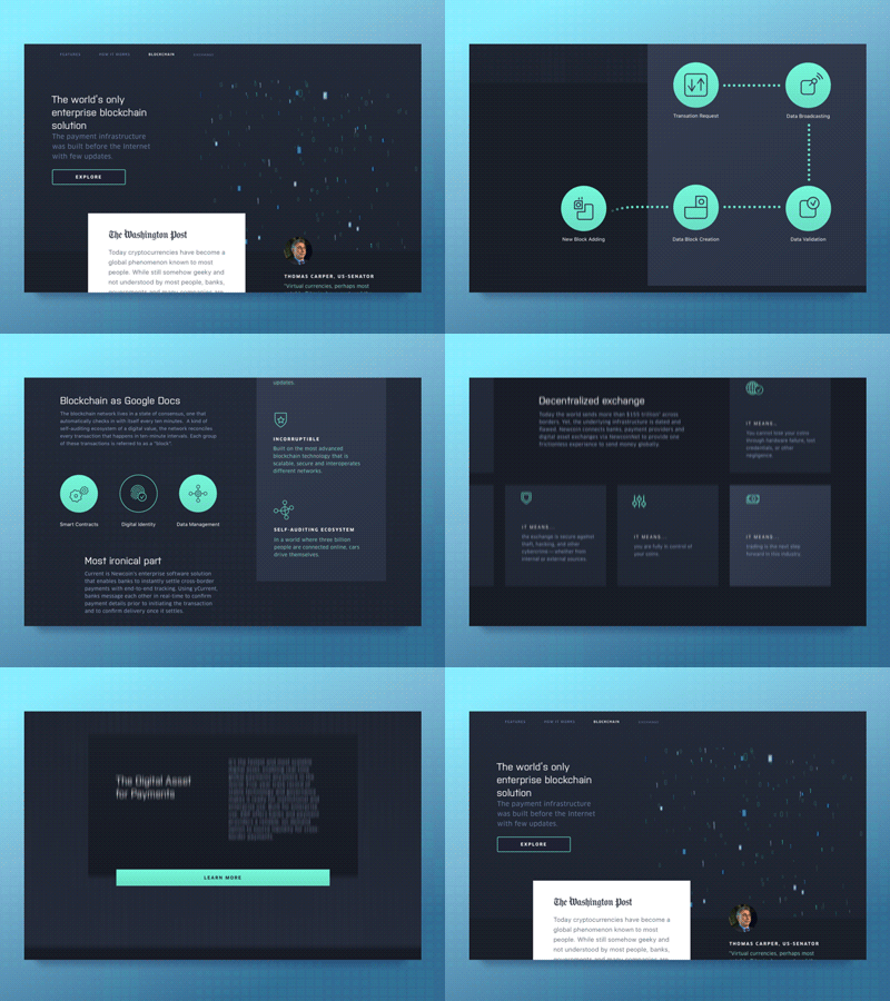
What we’d like to share today is a homepage design animation we created here at Zajno for some cool clients of ours who developed a global payment system built on the most advanced blockchain technology that is scalable, secure and interoperates different networks. The platform connects banks, payment providers, digital asset exchanges and corporates to provide one frictionless experience to send and exchange money and cryptocurrencies globally.
Goals
Our job was to create a top-notch website design for the platform matching its innovative nature. What you see above is the website’s animated homepage which introduces the platform to the public outlining its main benefits. We created this animation to show how interaction design can benefit the overall user experience, adding more life to it and just making it look cool!
Approach
The main requirement to the website’s style was for it to match the futuristic nature of the technology, so we tried to find the color palette that would create that feel. We also used matrix-style animated background for the same purpose. Using subtle animations we added smoothness to the elements transitioning. And we also used some animated illustrations to liven up the page scroll, so that it looks more dynamic.
Results
We ended up with an intuitive, futuristic homepage design that organizes user interface in a purposeful and consistent way and a smooth animation of it. That’s pretty much it.
Let us know what you think about that! Share your ideas!
Press "L" to show some love!
ᗈ Join our Newsletter!
ᗈ Website
ᗈ TheGrid
ᗈ Spotify
ᗈ Twitter
ᗈ Medium
ᗈ Facebook
ᗈ Instagram

