💎 Travel Package Booking - Payment Checkout
Team: @flyin.com
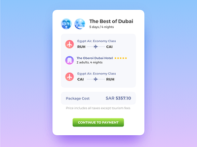
This is a rebound shot to our previously posted 'Travel Package Review Page UI'. The idea was to improve our current checkout flow design. This is a concept design for how we can make it look neater and clear. The little card displayed here forms a summary of the entire package along with all the inclusions to give the users a clearer idea of what all they're paying for.
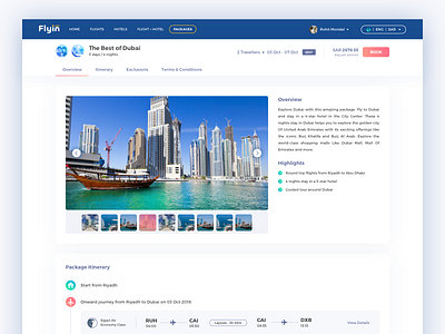
Please check the attachment for the entire page design. Would love some feedback.
PS: Don't forget to press L or F 😛
You can follow our team's work here: @flyin.com
More by Rohit M View profile
Like


