💎 Travel Package Review Page UI for Web
Team: @flyin.com
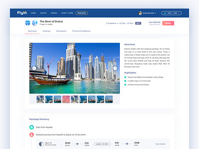
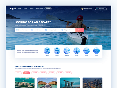
This is a rebound shot to our previously posted 'Travel Package Landing Page UI'. After completing the landing page design, our next task was to improve the current Package Review page, to give it a cleaner and a modern look. Few elements consuming unnecessary spaces have been removed; use of white spaces been given some importance. All the information on the page has been divided into different sections and tabs have been introduced for easy navigation. The CTAs are highlighted for better visibility and the flights & hotel info has been put in a very minimal way with a 'View Details' link to save space.
Let me know your feedback on this one.
(Check attachment for hi-res)
PS: Don't forget to press L or F 😛
You can follow our team's work here: @flyin.com


