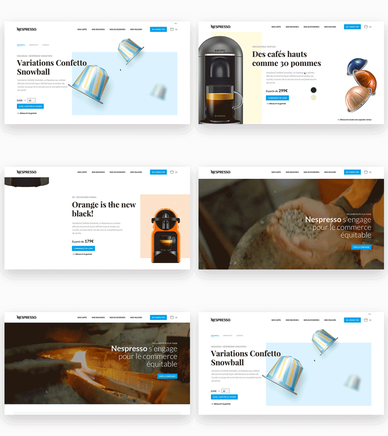
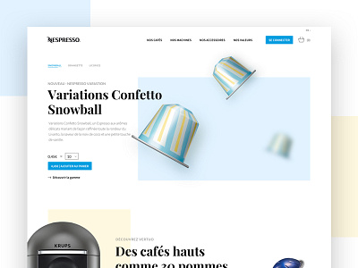
Nespresso Homepage Redesign Animation
Last month I gave my students homework: "Redesign the old fashionned and un-UX-friendly nespresso website". I gave myself the same challenge and here's the result.
I wanted to give a fresh new look of a renewing brand.
Check out real pixels attached and be sure to check the rebound shot.
Sorry for the poor gif quality. Made it quickly for fun only.
More by Arthur Guillermin Hazan View profile
Like

