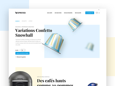
Nespresso Homepage Redesign
Last month I gave my students homework: "Redesign the old fashionned and un-UX-friendly nespresso website". I gave myself the same challenge and here's the result.
I wanted to give a fresh new look of a renewing brand.
Check out real pixels attached and be sure to check the rebound shot.
More by Arthur Guillermin Hazan View profile
Like

